Colors are directly linked to our moods. They are specific in the emotional and psychological responses they invoke. They also dictate our response and associations with a design/visual. Hence, they are considered an extremely important element of design. The colors we choose reflect the theme of our topic and if both are incongruent then the viewer might get confused or fail at comprehending the information correctly.
A good color combination brings clarity and makes it easier for the viewers to absorb the subject matter. According to research, colors increase brand recognition and retention by almost 80%. They enhance user memory and association with the brand and later seeing those colors helps consumers in recalling the brand. For ex: Yellow color for McDonalds, cherry red for Coca-Cola and so on. Emphasis on using the right colors while designing a logo is as crucial as choosing the right name for your brand.
Colors activate certain parts of your brain, usually on the left side. Certain colors dominate attention more than others and engage the brain with creativity and particular kinds of thoughts and emotions. Further, we have also made associations with particular colors like yellow for positivity, blue for coolness, green for natural, red for anger etc.
There is a huge variety of colors available. Over 8 million user named colors and 16 million hexadecimal color combinations are available on the digital platform. With such a vast number of options, designers may get confused while choosing a color for their palette. Out of these endless choices, it is advised to choose a maximum of 3-4 colors for creating a color palette. Here are some tips and ideas on where to look for inspiration to find great color palettes and how to work with colors to produce optimum results.
1. Get inspired on-the-go
Searching for appealing color combinations is easy and fairly simple when you look at your surroundings with a keen eye. Some amazing color palettes can be created by taking a clue from mother nature. Flowers, plants, animals, sky, earth, everywhere there are colors and beautiful patterns. Simply taking a beautiful photograph of a flower, a sunset or leaves and sampling those colors directly in a photo editing software gives you a wonderful color palette in no time at all. This is a quick, easy and effective method to create a unique color palette without too much pressure. You can explore the different hues and colors from a photograph and build your own color palette inspired directly by nature.
2. The color wheel
The color wheel is a reference wheel/design to help designers choose the right colors. The quote by artist Marc Chagall, “All colors are the friends of their neighbors and the lovers of their opposites,” can be used to remember how to use the color wheel in the right way. Use analogous colors to show depth and shadows to titles or even backgrounds. Being closely related the colors depicted next to each other in the wheel blend really well and opposing colors work best as complimentary color combinations.
3. Inspiration from other designs
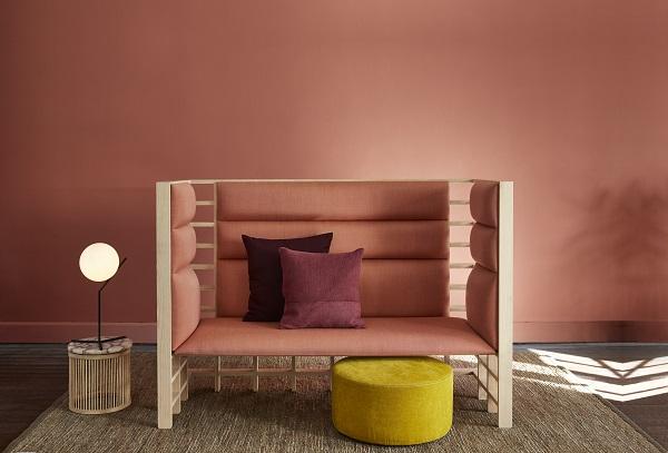
Interior designers harmonize physical spaces using objects, textures and color schemes that blend well with each other. Inspiration can come from anywhere. Do you get any ideas from looking at visually attractive interior or exterior designs? Designers mostly use a 3 color combination in this ratio:
- Dominant color occupies 60%
- Secondary color is given 30%
- Accent color takes up 10%
If you still need to introduce a fourth color to the design, you can perhaps use a tint or shade of the dominant or secondary color. Also keep your eyes peeled to your surroundings (rooms, buildings, walls, paintings, decorative items) to discover some amazing color palettes.
4. Color mood boards
Great color schemes are available everywhere. You can find them in historical monuments, paintings, photographs, book covers, creative ads, package designs and in online and print sources. You can keep saving good designs with excellent color palettes and later use them when you need to create your own color palette. Color mood boards are like a color palette repository which comes in handy at times of need.
5. Color swatches
A physical color swatch is resourceful when a digital color wheel won’t cut it. They come in handy when clients need to see the colors physically on paper and not on a screen. Swatches also have hexadecimal color code for each other for easy transition into digital medium and easy palette development.
6. Colors from nature
There are endless beautiful color combinations in nature, all you have to do is look closely to discover them. Landscapes, plants, animals, fruits, flowers etc., all have amazing, freely accessible color combinations. The wings of a butterfly or the shades on a flower petal are some examples that can leave you mesmerized. Colors that invoke all kinds of emotions are present vividly in nature. For ex: forest green and ocean blues are some cool colors palettes and sunset and sunrise give warm palettes. There are literally millions of inspiring examples if you just look outside the window.
7. Stick to 3-4 colors at max
Unless the design demands more than a few colors it is best to stick to 3-4 main colors at max. Avoid combining an excessive amount of colors or it may clutter your design. If you are unsatisfied with a design, look again and see if you can cut down the number of colors to make the design more simple and neat.
8. Match color to subject/topic
Consider the topic you are trying to portray/depict before you decide on the colors. Do the colors match the topic, its theme etc.? Think of the specific emotions and moods you want to evoke with your color palette. Obviously, there would be different color palettes for a beach party brochure and a sports brochure, likewise colors for a kitty party and for a bachelor party would be different. This can be done better if you work out 2-3 basic colors related to your subject topic before finalizing on your color palette.
Research, view some good designs and observe their color schemes, see how colors cast psychological and emotional changes in people. Colors must be chosen with purpose and reason for the maximum impact.
9. Search around for themed pallets
There are several platforms like pinterest which offer theme wise color pallets which are curated by creatives around the world. For ex: summer color palettes, cool colors, party colors etc. Color palettes concerning different fields of designing like interior design, website design, fashion, graphic and event design etc. are available online.
10. Follow some great websites for color resources
Creative artists from around the world create and share color palettes and patterns for other designers. Join and follow such websites to get great ideas and learn more about color combinations, color theory and how colors work with designs and audiences. Undoubtedly, colors are important in designing and utmost care and attention must be given to them. They go a long way in establishing a brand identity and facilitating things like brand recall and retention. Moreover, consistency in colors is more important. Do not change your theme frequently unless it is necessary to your design. Concentrate on the effect colors have on viewers and you will have a great color palette for your design in no time at all.
Remember that a user does not view webpages or elements as separate entities but experience the whole website as one single package. The strategy should always be to interconnect everything since it counts a lot towards a better user experience. A website design is an art and it is meant to connect emotionally with the user.