Wattyl has shared some insights on turning your home into a relaxing haven.
Ordinarily, our home is a sanctuary, the place we leave walk into in the evening to relax and spend time with loved ones.
In these corona-enforced lockdown times, the home has become much more – it’s an office, a school, a gym, a movie theatre or restaurant, and more. We all crave peace and calm, reassurance and wellness, and colour can play a pivotal role in this.
Wattyl is very aware of the psychological impact colour can have and, to that end, has shared some insights on what colours to use to create the best environment in your home.

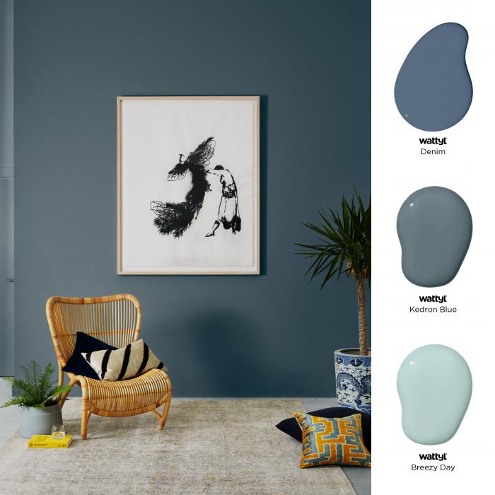
A selection of Wattyl blues.
Blue Soothes
Blues are universally recognised as peaceful, calm and gentle and can have great power in managing stress says Wattyl colour expert Sarah Stephenson.
Blue hues sooth and calm our minds, reduce our heart rates, lower blood pressure and reduce anxiety. Deep sea blues such as Denim, the soft sky blue of Kedron Blue or the beautiful aqua of Breezy Day are all ideal for creating a tranquil setting in a living room or bedroom.
Going Green
As to be expected, green suggests a deep connection with nature. Quiet and restful, green symbolises renewal and hope, and can diffuse enxiety. Wattyl recommends shades that connect us to our environment such as the soft grey/greens of the eucalypt – Sooty Owl, Cloud and Rhino are great examples.

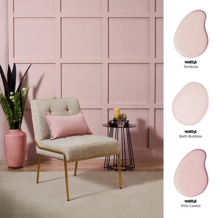
A selection of Wattyl pinks.
A spa-like experience
Soft blush tones and muted pinks are perfect for a spa-like feel that helps us to relax and unwind. Layered tone-on-tone, these pink hues create a harmonious and soothing ambience to a space, creating a sense of optimism. Colours such as Tombola, Bath Bubbles and Pink Caress strike the right balance.
Feel at Home
Warm, neutral colours feel homely and relaxing, and are always a safe bet especially in spaces with minimal clutter and an accent on texture in other decorative elements.
Balance is key and Wattyl recommends not using neutrals with too much pink or yellow undertone – instead, steer towards warm neutrals like Confetti Shower, Creamy Coffee and Talc.

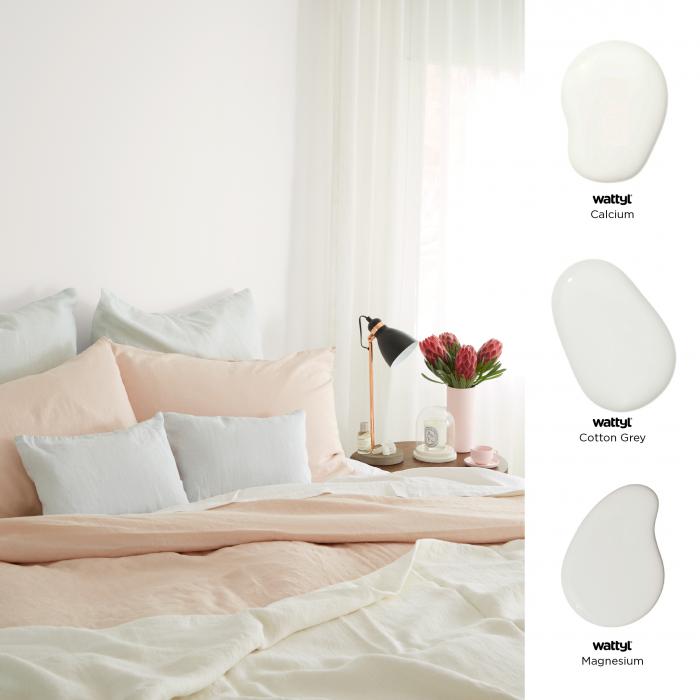
A selection of Wattyl whites.
Everything will be all white
Symbolising clarity and freshness, white will clear minds and create the perception of having room to breathe. Avoid overuse as this can result in an emotionless, sterile environment. Go-to options are Calcium, Cotton Grey and Magnesium.
A deep sleep
Essential to our wellbeing, sleep is aided by rich colours such as the deep forest green of Sashimi, paired with Midnight Seas. This Wattyl colour combination will put reassuring distance between you and the outside world.