A number of Australian and New Zealand residential projects were awarded or commended at the recent Dulux Colour Awards, which praised that entrants for a new level of innovative and considered use of colour.
More than 450 entries were received across six categories of architecture and design.
Dulux colour and communications manager Andrea Lucena-Orr remarks: “The level of sophistication, creativity and masterful use of colour continues to rise each year. Architects and designers are becoming increasingly bold and adept at employing paint as an integral element in the design of both internal and external spaces and this is evident across all the winning projects.”

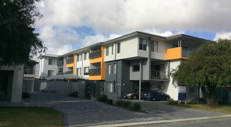
- Social Housing Development Rangiora by Rohan Collett Architects | New Zealand. Photographer: Lightforge - Dennis Radermacher.
In the Commercial and Multi-Residential Exterior category, a social housing development in Rangiora, New Zealand by Rohan Collett Architects received a commendation, and was also the winner of the NZ Grand Prix.
The redevelopment project, designed for individuals over the age of 55 is described as “beautifully executed, even edgy” by the judges, who note that social housing often has a uniformity or blandness to it.
They say: “The colours and materials give residents’ homes their own identity; theyare not part of a housing mass but rather a community, at a human scale. The architect has carefully considered the impact of colour on a building’s or village’s inhabitants, and opted for a high degree of cohesion, with a spattering of deliberate irregularity to avoid the stigma of complete uniformity.”

Perfect Storm by Green Anvil Co + Killing Matt Woods + Set For Art. Photographer: Kat Lu.
In the Residential Interior category, Green Anvil Co, Killing Matt Woods and Set For Art were announced as winners for their project Perfect Storm in NSW.
The judges praised the project for avoiding the “ubiquitous industrial cliché”, saying the warehouse renovation instead is a Brutalist-inspired marvel.
“The use of a single colour and finish, with the appearance of concrete, on all painted surfaces has a surprisingly warm cocooning effect, which is amplified by the soft curve where walls meet ceilings. It is utilitarian chic at its best – intimate, moody, balanced – and awarded for its simplicity and singularity.”

Ruckers Hill House by Studio Bright. Photographer: Rory Gardiner.
In the same category, Studio Bright’s project, Ruckers Hill House in VIC received a commendation for its strikingly balanced distinction between the old and new in a refurbished period home.
The judges complimented the embrace of individuality and expression in saturated colour.
“Palettes have been devised to reflect the personal nuances of each room’s main occupant: the yellow of a beloved football team, a powder blue for its subtle femininity, and greens as backdrops for teen paraphernalia. The main bedroom incorporates its owner’s eclecticism, in contrasting pinks and greens. It is a unique palette that has driven design decisions and been cleverly employed to distinguish between the old and new architectural components, as well as the unique personalities within.”

Casuarina House by Vokes & Peters. Photographer: Christopher Frederick Jones.
When it came to residential exteriors, Vokes & Peters took the spoils for the Casuarina House in NSW which the judges described as “impactful in its simplicity”.
The new family home promotes an outdoor lifestyle, facilitating an easy flow between the inside and out.
The judges remark: “Its Capsicum Red-painted external timbers and the sandy brickwork and masonry elements are perfectly balanced and contrast strikingly with the native foliage. Described by the architects as bright and defiantly modern when hit by the direct sun, the statement red exterior becomes subdued and moody when shaded, transforming the architectural expression from day to night.”

Split House by Pac Studio. Photographer: Simon Devitt.
In the same category, Pac Studio received a commendation for the Split House in New Zealand, a heritage villa in Auckland that has been enlivened with colour.
The judges say: “Here, the strategy has been to paint only the cut face of the vertical timbers, creating an optical illusion or sequence of disclosure as one moves across the site. It is an innovative and well-executed play of bold and neutral colour that surprises and delights.”
Finally, in the student section, Ying Ho Shiu (HIRO) from RMIT designed the Hump House which received a commendation.

The Hump House by Ying Ho Shiu (Hiro), RMIT. Photography: Ying Ho Shiu (Hiro).
The judges said: “The desert vibe is strong in this sustainable house proposal, with its rammed-earth walls and neutral colours and textures. Beautifully sited in the landscape, its bleached tones mirror the natural material selections and are contrasted occasionally with copper and a pop of Marrakesh Red. It is strong and serene.”
- PERFECT STORM by Green Anvil Co + Killing Matt Woods + Set For Art
Photographer: Kat Lu